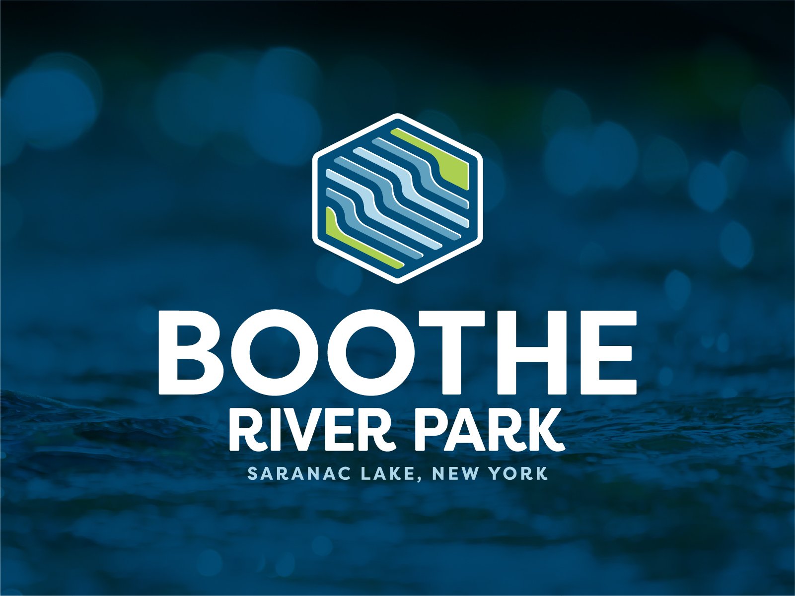
Boothe River Park is a project that will build a whitewater surf feature in Saranac Lake, New York. Not only will this be a draw for whitewater enthusiasts, the planned rehabilitation of the streamed and shore will increase enjoyment for anglers and the general public as well.
The BRP committee needed a visual identity to help them in their fundraising and communication efforts. They wanted a logo that was bright, clear, and that would work across a variety of mediums including digital presentations, social media, print, and apparel.
Like many of my branding projects, the first step is to sketch as many ideas and versions of those ideas that it takes to find a solution.
The plan for the river park includes a single wave feature. I wanted to make sure that the mark hinted at that, without being overly obvious. Plus, the feature does not exist yet, so a hyper realistic illustration would not be advisable.
It’s sometimes difficult to bring hand drawn geometric elements into the digital space. I find that establishing some common angles and parallel lines help to bring that shape into alignment.
Once the shape has been established, I round the corners and set the curves of the lines of current, to bring back a more organic feel.
If I have a “style” of with logos, it’s an offprint effect. It makes the logo feel like a real object, even when it’s being displayed digitally.
I paired this new mark with the Filson typeface because it’s a bold san serif with some fun flourishes like the leg of the R.
It’s important for brands to be flexible. It’s not always possible — or desirable — for the logo to be display on a white background. I created an inverted full color version to be used on dark backgrounds.
Since the mark has multiple colors in it, creating a single color version isn’t as simple as just changing the color. I created specific versions for one color dark and one color light applications.


